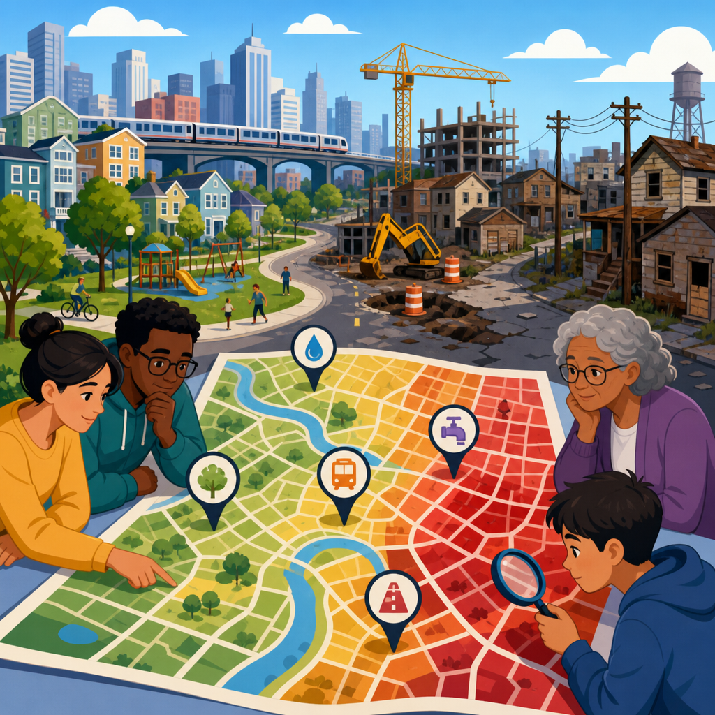
Infrastructure equity mapping asks a simple but consequential question: which neighborhoods wait the longest for basic public investment, and why? In urban planning, infrastructure includes roads, sidewalks, storm drains, water lines, streetlights, transit stops, tree canopy, parks, broadband, and the civic systems that keep daily life safe and functional. Equity mapping is the practice of combining location data with demographic, service, and capital improvement records to show where needs are concentrated and where public action has lagged. When cities map delay, not just asset location, they can see patterns that ordinary budget documents hide.
I have worked with capital plans, pavement indexes, and service request datasets long enough to know that residents rarely experience infrastructure as a spreadsheet line item. They experience it as the bus stop without shelter in summer heat, the flooded intersection after routine rain, the water main break that keeps happening on the same block, or the sidewalk gap that turns a quarter mile walk into a dangerous detour. Those conditions are not randomly distributed. In many cities, neighborhoods with lower incomes, higher renter shares, larger Black or Latino populations, older housing stock, or weaker political representation often wait longer for repair, replacement, and modernization. Mapping makes those waiting periods visible.
This matters because delay is itself a policy outcome. Most public works agencies already track condition, but condition alone can miss inequity. Two streets can have the same pavement rating while one has waited twelve years for resurfacing and the other just entered the queue. Two neighborhoods can have similar numbers of stormwater complaints while one has repeatedly received drainage projects and the other remains in study mode. Infrastructure equity mapping shifts attention from isolated assets to cumulative burden. It helps planners compare need, spending, response time, and project delivery across places, then explain decisions in a way residents can test against lived reality.
Done well, this approach supports better budgets, stronger capital improvement programs, and more defensible public communication. It also creates a practical hub for related work across urban planning and policy, because delay connects transportation, housing, climate resilience, public health, utilities, environmental justice, and land use. A map that shows who waits longest is not just descriptive. It is a management tool, a transparency mechanism, and often the first honest baseline a city has for correcting uneven investment.
What Infrastructure Equity Mapping Measures
At its core, infrastructure equity mapping measures distribution, condition, exposure, and time. Distribution asks where assets are located: sidewalks, hydrants, bus lanes, flood control facilities, parks, and so on. Condition asks whether those assets are functioning adequately, often using standards such as pavement condition index, facility condition index, level of service targets, Americans with Disabilities Act compliance status, or utility break frequency. Exposure asks who is affected, linking assets to population characteristics like age, disability status, income, race, language access, housing tenure, and vehicle ownership. Time asks how long residents have waited from complaint, identification, or programmed need to actual delivery.
That time dimension is the difference between a standard asset map and an equity map. In one city project I reviewed, a simple choropleth of sidewalk gaps did not show a strong pattern. But once we added request dates, crash history, school walking routes, and the year each segment first appeared in the capital plan, a clear picture emerged: lower income neighborhoods had gaps that persisted far longer, even when pedestrian risk was comparable. The policy question changed from “where are the missing sidewalks?” to “why do some residents wait twice as long for the same safety intervention?”
Agencies usually pull these measures from work order systems, 311 platforms, GIS asset inventories, capital improvement plans, utility records, transit databases, census products, and environmental screening tools. Common sources include the American Community Survey, local assessor data, stormwater models, traffic injury networks, and state environmental justice indexes. The key is standardization. If one department records project initiation while another records funding authorization, timelines become misleading. Reliable equity mapping requires consistent definitions for request date, prioritization date, design start, funding commitment, construction start, completion, and post-project service level.
Why Some Neighborhoods Wait Longer
Long waits usually come from institutional routines rather than one explicit policy. Legacy underinvestment is a major driver. Neighborhoods annexed later, redlined historically, or zoned for industrial uses often inherited weaker infrastructure and fewer political champions. Once deterioration compounds, agencies face larger replacement costs and may defer action further because the projects no longer fit annual maintenance budgets. This creates a backlog trap: the places needing the most work become the least likely to receive quick fixes.
Data quality also shapes delay. Wealthier areas often produce cleaner administrative signals because residents submit more service requests, attend more public meetings, and know which office to call. If prioritization leans heavily on complaint volume, quieter neighborhoods can look lower need despite worse conditions. I have seen storm drain maintenance maps that overrepresented organized homeowner areas simply because blocked inlets were reported quickly, while lower visibility streets flooded repeatedly without entering the system at the same rate.
Project delivery rules matter too. Matching grant requirements, benefit-cost formulas, and state funding categories can unintentionally favor corridors with higher traffic counts, stronger tax bases, or development momentum. A sidewalk near a growing commercial district may score higher than one serving a bus-dependent residential area because the model values economic throughput over household safety. Similarly, utilities often replace lines where coordinated street reconstruction is already funded, leaving isolated low income blocks waiting for standalone projects that are harder to schedule.
Political influence is real, even when planners prefer not to say it plainly. Council offices, business improvement districts, and major institutions can accelerate studies, secure design funds, or move projects up the queue. None of that proves corruption; it reflects how public systems respond to organized pressure. Equity mapping gives staff and elected officials a way to test whether those accelerations are creating measurable disparity elsewhere and to justify corrective criteria transparently.
How Cities Build an Equity Map
The best infrastructure equity maps are built in stages. First, define the unit of analysis. Census tracts are useful for demographic comparison, but block groups, service areas, street segments, or utility pressure zones may better match how infrastructure works. Second, inventory assets and normalize condition metrics so departments can be compared. Third, create a delay metric. For maintenance work, that may be median days from request to completion. For capital projects, it may be years from documented need to delivery. Fourth, layer in population vulnerability and environmental exposure.
Fifth, score cumulative burden rather than relying on one indicator. A neighborhood with poor pavement, low tree canopy, repeated sewer backups, and long bus stop upgrade delays may rank higher than one with a single severe issue. Sixth, validate the map with field checks and resident review. Desktop analysis catches patterns, but curb ramps that technically exist may still be unusable, and drainage projects listed as complete may leave adjacent parcels exposed. Finally, publish methods clearly. Residents should be able to understand why a place scores high, what data year was used, and what the map does not capture.
| Metric | What it measures | Useful data source | Common equity warning sign |
|---|---|---|---|
| Median repair time | Days from request to completion | 311 and work order systems | Slower response in lower income tracts |
| Capital delivery lag | Years from identified need to construction | Capital improvement program records | Projects repeatedly deferred in the same districts |
| Asset condition | Physical state of roads, pipes, lights, sidewalks | GIS inventories and inspections | Worse conditions where replacement cycles are longest |
| Service access | Distance or barriers to usable infrastructure | Network analysis and field audits | Longer walks to safe transit stops or parks |
| Cumulative burden score | Combined infrastructure and vulnerability factors | Census, environmental, and agency data | High need with low investment over time |
Modern tools make this easier than it was a decade ago. Cities commonly use ArcGIS Pro, ArcGIS Online, QGIS, Cartegraph, Cityworks, OpenGov, Power BI, and custom dashboards tied to enterprise asset management systems. The software is not the hard part. Governance is. Departments must agree on data stewardship, refresh schedules, and how scores influence budgeting. Without that, equity maps become attractive presentations rather than operating tools.
Real-World Patterns the Maps Reveal
Across the United States, recurring patterns appear when delay is mapped carefully. Sidewalk completeness is often lowest in postwar fringe neighborhoods annexed without urban street standards and in older disinvested areas where reconstruction never caught up. Streetlight outages tend to persist longer in zones with fewer nighttime commercial uses, even though residents there may face higher safety concerns. Water main breaks cluster in older pipe networks, but replacement timing can still diverge depending on whether the corridor is tied to redevelopment or visible commuter routes.
Flood risk shows the value of combining infrastructure and social data. Two basins may have similar modeled runoff, yet one contains more renters, more ground-floor units, fewer insured households, and less tree canopy. If both wait the same length of time for drainage upgrades, the practical harm is not equal. Equity mapping helps planners move from “equal treatment” to proportionate response. That distinction is essential in climate adaptation, where heat, flooding, and air quality burdens overlap with longstanding public investment gaps.
Transit infrastructure tells a similar story. Agencies often improve high-ridership stops first, which is reasonable from an operations perspective. But if shelters, seating, lighting, and ADA boarding pads are added only where boardings are already strongest, low amenity stops in lower income areas can remain uncomfortable and inaccessible for years. A fair map compares not just ridership, but rider dependence, transfer exposure, injury risk, shade, and wait environment. In practice, that often changes which stops rise to the top of the investment list.
Using Maps to Change Policy, Not Just Describe It
An equity map has value only if it changes decisions. The most effective cities tie mapping results directly to capital scoring, maintenance routing, and performance management. For example, a pavement program can reserve a percentage of annual resurfacing funds for segments in high-burden areas, even if traffic volume is lower. A sidewalk program can award extra points for routes serving schools, senior housing, transit dependence, and long documented wait times. Utility replacement plans can add a vulnerability multiplier when break history intersects with medically fragile populations or repeated customer outages.
Budgeting should also distinguish between maintenance equity and capital equity. Fast pothole response does not compensate for decades without full reconstruction, and a new park does not erase unresolved sewer capacity issues. Separate scorecards help avoid substitutions that look good publicly but do little to reduce the deepest backlog. I advise cities to publish three views at minimum: current condition, cumulative spending over ten years, and average delivery time by neighborhood. Together, those measures show whether visible improvements are actually narrowing disparity.
Community engagement needs to be structured around verification and priority setting, not symbolic consultation. Residents are usually excellent at identifying missing variables: alley flooding that never reaches the main road sensor, bus stops avoided after dark, curb ramps blocked by utility poles, or private drainage failures masquerading as public ones. When staff document how those observations changed the map or project list, trust increases. When engagement produces no traceable adjustment, skepticism hardens quickly.
Limits, Tradeoffs, and What Good Practice Looks Like
Infrastructure equity mapping is powerful, but it has limits. Not every delay is inequitable; some projects legitimately take longer because of environmental review, utility conflicts, right of way acquisition, or coordination with state agencies. Demographic targeting also requires care. The goal is not to reduce people to categories or to imply that every lower income area has identical needs. Good practice uses equity factors as decision support while retaining engineering judgment, legal compliance, and transparent exceptions.
Data gaps can distort results. Census estimates have margins of error, administrative boundaries rarely match how people move through neighborhoods, and historical records may omit projects delivered before modern systems existed. There is also a scale problem: a tract average can hide sharp differences within a few blocks. Field audits, resident testimony, and periodic methodology reviews are essential safeguards. So is humility. If the map says one thing and consistent on-the-ground evidence says another, planners should investigate rather than defend the model reflexively.
The strongest programs share several habits. They update maps on a routine schedule, usually annually or semiannually. They document assumptions publicly. They compare spending and wait times before and after policy changes. They link maps to measurable service standards, such as maximum response times or target replacement cycles. And they treat equity as an operational requirement, not a communications theme. That is when mapping stops being an overlay and becomes a durable part of urban planning and policy.
Infrastructure equity mapping gives cities a practical answer to a question residents ask constantly: why does our neighborhood keep waiting? By measuring condition, access, exposure, and delay together, planners can identify where public investment has lagged and who bears the cost of that lag. The most important insight is that inequity often appears not only in what infrastructure exists, but in how long people must wait for safe, reliable, modern service compared with other parts of the same city.
For public agencies, the benefit is better decision making. Equity maps turn scattered datasets into a clear framework for prioritizing repairs, sequencing capital projects, and explaining budgets. For residents, the benefit is transparency. They can see whether long-standing complaints are isolated incidents or part of a broader pattern of underinvestment. For elected officials, the benefit is accountability backed by evidence rather than anecdotes alone. Those are practical gains, especially when budgets are tight and tradeoffs are unavoidable.
If you are building an urban planning and policy agenda, start here. Audit the data you already have, define a neighborhood-level delay metric, and publish the first version even if it is imperfect. A credible baseline creates momentum. Once a city can see which neighborhoods wait the longest, it can begin the harder and more important work of shortening those waits fairly.
Frequently Asked Questions
What is infrastructure equity mapping, and why does it matter when comparing neighborhoods?
Infrastructure equity mapping is a way of using geographic data, public records, and demographic information to identify where basic public investments have been delayed, underfunded, or unevenly distributed across a city or region. Instead of looking at one project at a time, it layers information such as road condition, sidewalk coverage, transit access, stormwater capacity, tree canopy, streetlight placement, water and sewer upgrades, park access, and broadband service with factors like income, age, race, disability, language access, and housing conditions. The goal is to make visible what residents often already know from lived experience: some neighborhoods wait longer for repairs, replacements, and upgrades that are routine elsewhere.
This matters because infrastructure is not just about physical assets. It shapes safety, health, mobility, economic opportunity, and quality of life. A missing sidewalk can make it harder for children to walk to school, older adults to reach a bus stop, or wheelchair users to travel independently. Poor drainage can lead to repeated flooding, property damage, mold, and public health risks. Weak tree canopy can increase heat exposure in summer. Limited broadband can reduce access to work, education, telehealth, and government services. When these conditions cluster in the same places over many years, they can reinforce broader patterns of inequality.
Equity mapping helps planners, journalists, advocates, and residents move from anecdote to evidence. It can reveal whether neighborhoods with high need are consistently scheduled later in capital plans, whether complaint-based systems favor areas with more political access, and whether maintenance and replacement cycles are truly fair. In practical terms, it gives decision-makers a stronger basis for prioritizing investment where the consequences of delay are most severe, not simply where the loudest voices are heard.
Which types of infrastructure are usually included in an equity map?
Most infrastructure equity maps include the systems people rely on every day to move safely, stay healthy, and participate in civic life. Common categories include transportation features such as road pavement quality, sidewalk presence and condition, curb ramps, bike facilities, transit stops, crosswalks, traffic calming, and streetlights. Utility and environmental systems are also central, including water mains, sewer lines, storm drains, flood risk, green infrastructure, and the condition of public drainage networks. Public realm and neighborhood-support features often appear as well, such as parks, playgrounds, recreation centers, libraries, tree canopy, cooling resources, and public seating.
In many cities, digital and social infrastructure are increasingly part of the analysis too. Broadband availability, device access, and reliable cellular coverage can now be as important to daily functioning as a road or bus line. Some mapping projects also examine emergency response access, public facility conditions, school-adjacent safety improvements, and the location of civic services such as health clinics or service centers. The right mix depends on the article’s focus and on what data a city actually maintains with enough consistency to compare neighborhoods fairly.
What makes an equity map useful is not the length of the asset list but the connection between infrastructure condition, service levels, and community need. A neighborhood may technically have a bus stop, for example, but if the stop lacks shelter, lighting, sidewalks, and frequent service, access is still limited in practice. Likewise, a park that exists on paper may not function as a meaningful neighborhood asset if it is poorly maintained or difficult to reach safely. Strong equity mapping therefore goes beyond simple presence-or-absence and asks whether infrastructure is adequate, reliable, safe, and timely relative to the people who depend on it most.
How do analysts determine which neighborhoods wait the longest for public investment?
Analysts typically answer this by combining several timelines and comparing them geographically. They may review capital improvement plans, maintenance schedules, permitting records, complaint histories, inspection reports, asset management systems, and project completion dates to measure how long neighborhoods wait between identified need and actual investment. In some cases, they compare the age of infrastructure assets, the frequency of repairs, or the time elapsed since the last major upgrade. In others, they examine whether areas with repeated flooding, broken sidewalks, failing pavement, or inadequate lighting remain in planning documents year after year without being funded.
A strong analysis also distinguishes between different kinds of waiting. One neighborhood may wait a long time for a large capital project like sewer replacement, while another may experience chronic delays in basic maintenance such as pothole repair, streetlight replacement, or curb ramp installation. Both matter, but they point to different administrative and budget processes. Analysts often create indicators such as average project lag, maintenance response times, unmet need density, or the share of overdue assets within a census tract, corridor, or service district.
To make the comparison meaningful, waiting times are usually paired with need and vulnerability measures. A ten-year delay in a low-risk area is not equivalent to a ten-year delay in a neighborhood with high crash rates, frequent basement flooding, older residents, low vehicle ownership, or limited political representation. That is why the most credible equity maps do more than show project dates. They show where delays overlap with the greatest daily consequences, making it easier to identify patterns of structural neglect rather than isolated scheduling issues.
Why do some neighborhoods consistently receive upgrades later than others?
There is rarely a single reason. In many places, delayed investment is the result of historical patterns layered over current decision-making systems. Past redlining, segregation, uneven annexation, industrial zoning, disinvestment, and exclusion from political power can leave neighborhoods with older infrastructure and fewer amenities to begin with. Once those conditions exist, they can persist if funding formulas prioritize asset value over resident need, if maintenance depends heavily on complaint reporting, or if capital planning rewards places that already have strong advocacy networks and technical capacity.
Administrative practices can deepen the gap. For example, cities may focus on roads that serve commuters before residential streets that serve lower-income households. Sidewalk programs may require matching funds or petition thresholds that are easier for wealthier areas to meet. Utilities may replace lines only when failure becomes severe, which can penalize neighborhoods that have endured poor conditions for decades. Data quality also matters: if a city does not track sidewalk condition, tree canopy loss, drainage failure, or bus stop amenities consistently, needs in underserved neighborhoods may remain undercounted and therefore underprioritized.
Political and institutional factors are also important. Neighborhoods with more time, social capital, legal expertise, or relationships inside government often navigate planning processes more effectively. Areas with renters, limited-English-proficient residents, or historically low trust in government may have valid needs that are less visible in conventional participation systems. That is why equity mapping is valuable: it helps shift the conversation from “who asked first” to “where are the risks and delays greatest, and what patterns explain them?” Done well, it supports a more accountable and transparent allocation of public resources.
How can cities use infrastructure equity mapping to make investment fairer and more effective?
Cities can use infrastructure equity mapping as both a diagnostic tool and a decision framework. First, it can identify where delays, deficiencies, and vulnerability overlap, allowing agencies to target limited dollars where they will reduce the greatest harm. Instead of spreading funds thinly or reacting only to visible failures, planners can rank projects using criteria that include condition, safety, climate risk, public health, accessibility, and the number of residents affected. This helps move investment from a purely reactive model toward a preventive and equity-centered one.
Second, mapping can improve transparency and public trust. When residents can see why some projects are prioritized, what data was used, and how long neighborhoods have been waiting, the planning process becomes easier to understand and evaluate. Public dashboards, story maps, and multilingual community summaries can make technical information more accessible. Cities can also publish equity metrics alongside budgets and capital plans, such as average wait times by neighborhood, percent of overdue assets in high-vulnerability areas, or the share of annual infrastructure spending directed to historically underserved communities.
Third, equity mapping can support better coordination across departments. Flooding, unsafe crossings, low tree canopy, and poor transit access often affect the same areas but are managed by different agencies. A shared map can help transportation, utilities, parks, housing, and emergency management teams align projects so that one investment reinforces another. For example, a street reconstruction can be paired with drainage upgrades, ADA improvements, bus stop enhancements, and shade planting rather than addressed in isolation. That approach is not only fairer; it is usually more cost-effective over time.
Finally, cities should treat equity mapping as an ongoing practice, not a one-time report. Conditions change, new data becomes available, and communities should have a role in validating what the map shows or misses. The most effective programs combine technical analysis with resident knowledge, regular updates, and measurable accountability. If a city can track where people have waited the longest and then demonstrate shorter delays, safer conditions, and improved service in those areas, equity mapping becomes more than a visualization exercise. It becomes a practical tool for delivering public investment where it is most overdue.


