
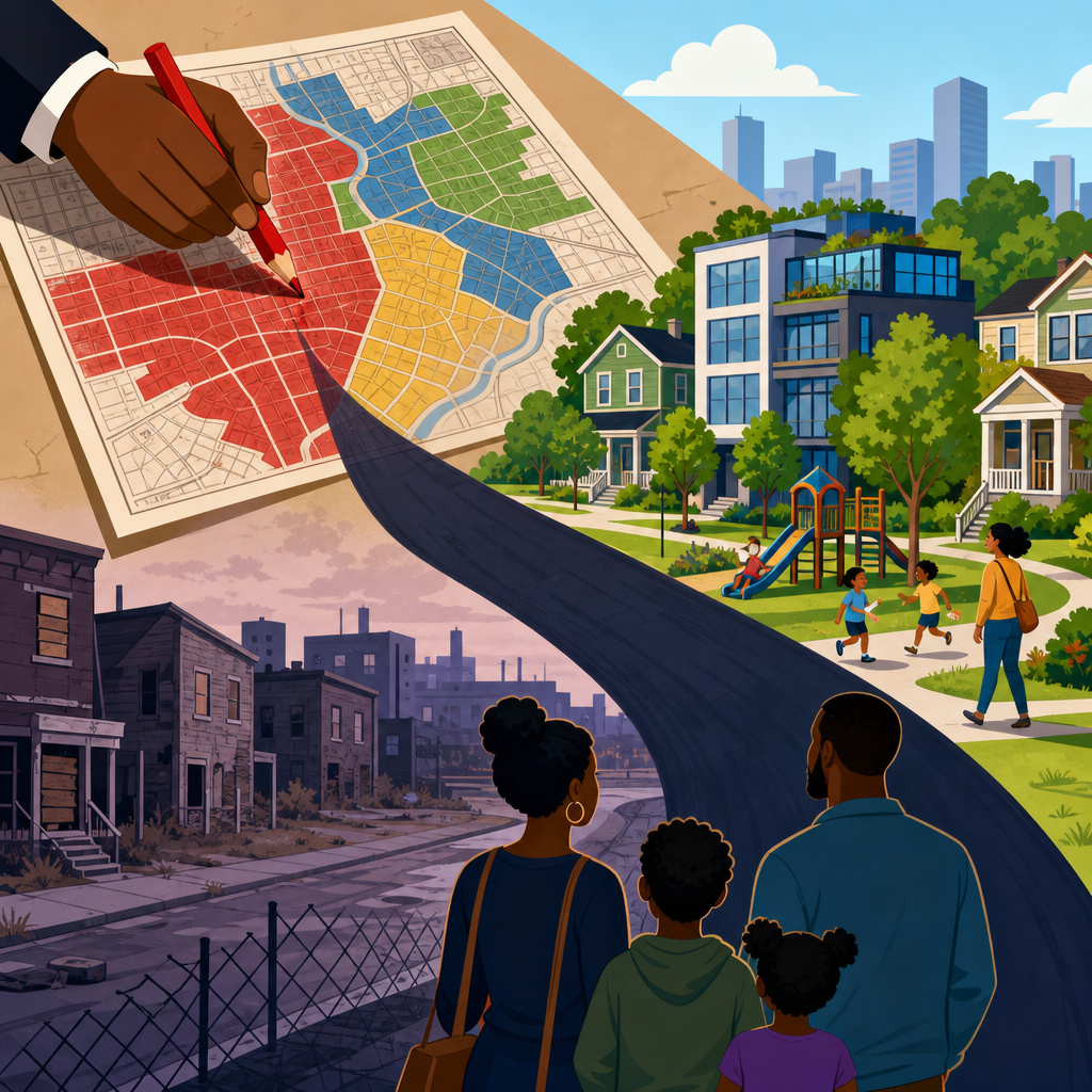
Redlining maps still shape housing opportunity in the United States because they turned racial bias into a durable geography of advantage and exclusion. In plain terms, redlining was the practice of labeling neighborhoods as risky for mortgage lending, usually because Black residents, immigrants, or working-class families lived there. The best-known records are the residential security maps created in the 1930s by the Home Owners’ Loan Corporation, which graded areas from “A” to “D” and shaded the lowest-rated sections red. Those maps did not create segregation by themselves, but they standardized it, amplified it, and gave public and private lenders a shared template for disinvestment. When I review city housing patterns today, I still see the imprint: lower home values in formerly redlined districts, fewer bank branches, older housing stock, higher asthma rates, and wider gaps in homeownership and inherited wealth.
Understanding redlining maps matters because housing is not just shelter. It is access to credit, schools, transportation, environmental quality, political influence, and intergenerational assets. A family that buys into a stable neighborhood with affordable financing can build equity over decades. A family blocked from those loans often pays more for worse housing and misses appreciation that compounds over time. Research from the National Community Reinvestment Coalition, the Federal Reserve, and university urban policy centers has repeatedly found that formerly redlined neighborhoods remain more likely to experience poverty, vacancy, heat exposure, and health burdens. The long shadow is therefore not historical trivia. It is a living structure that helps explain present-day inequality in metropolitan regions, from appraisal gaps to displacement pressures around new transit and redevelopment projects.
What redlining maps were and how they worked
Redlining maps were risk maps used by lenders, appraisers, and housing officials to judge where mortgage credit should flow. In the 1930s, the Home Owners’ Loan Corporation assembled local real estate professionals, bankers, and officials to describe neighborhood conditions. Their area descriptions routinely cited race, ethnicity, age of housing, and the “infiltration” of Black or immigrant residents as warning signs. Neighborhoods marked in green or blue were considered stable or desirable. Yellow areas were judged declining. Red areas were deemed hazardous. This grading system aligned with other federal policies, including Federal Housing Administration underwriting standards that favored racially homogeneous suburbs and discouraged loans in mixed or Black neighborhoods.
One point often gets lost: redlining was not a single law with one enforcement mechanism. It was a policy ecosystem. Restrictive covenants barred sales to nonwhite households. Exclusionary zoning limited multifamily or lower-cost housing in suburbs. Urban renewal later cleared many minority neighborhoods for highways, campuses, and civic projects. Appraisers used comparables that reflected segregation, and banks denied conventional mortgages where they expected slower appreciation. The maps became powerful because many institutions acted on the same assumptions. In practice, that meant a Black family in a redlined neighborhood might face loan denial, inflated contract sales, higher insurance costs, and underinvestment in public services at the same time.
How discrimination translated into today’s housing market
The core mechanism is cumulative disadvantage. Mortgage credit on fair terms allows households to buy earlier, borrow at lower rates, maintain property, and benefit from appreciation. Denial of that credit forces households into renting, informal contracts, overcrowding, or high-cost loans. Over one generation, the difference is large. Over three generations, it is enormous. The median American homeowner holds far more wealth than the median renter, and much of that wealth sits in home equity. Because redlining concentrated denial in specific neighborhoods and among specific racial groups, it shaped who accumulated assets and who did not.
Formerly redlined neighborhoods also experienced weaker municipal and private investment. Streets, parks, tree canopy, drainage, and code enforcement often lagged. Landlords deferred maintenance because financing was scarce and expected returns were lower. When capital did return decades later, it often arrived in the form of speculative acquisition rather than resident-centered improvement. I have seen corridor revitalization plans that raise adjacent land values quickly while long-time renters receive little protection from rising rents. That pattern is one reason the legacy of redlining shows up not only as disinvestment, but also as displacement when market interest returns.
| Legacy pathway | Historic practice | Present-day effect |
|---|---|---|
| Mortgage access | Loan denial or worse terms in red areas | Lower homeownership and less household equity |
| Property valuation | Biased appraisals tied to segregated comparables | Persistent appraisal gaps and weaker tax base |
| Public investment | Infrastructure and services steered elsewhere | Older housing, fewer amenities, higher repair burdens |
| Environmental exposure | Industrial siting and highways near marginalized areas | Higher heat, pollution, and health risks |
| Redevelopment pressure | Long underpricing followed by speculative reinvestment | Rising rents, displacement, and cultural loss |
Evidence of the long shadow in wealth, health, and place
Researchers have connected historic redlining to measurable outcomes across sectors. Studies published in environmental health and urban affairs journals have found that formerly redlined neighborhoods tend to have less tree cover and higher land-surface temperatures, which increases heat risk during extreme weather. Public health researchers have linked these same neighborhoods to elevated rates of asthma, preterm birth, and chronic disease, although the exact pathways vary by city and are shaped by pollution exposure, housing conditions, and access to care. Economists and housing scholars have shown that homes in once-redlined neighborhoods often appraise lower than similar homes in whiter neighborhoods, reducing household wealth and municipal revenue.
The effects are visible in city after city. In Chicago, contract buying stripped wealth from Black households shut out of conventional mortgages in the mid-twentieth century. In Los Angeles, freeway construction and industrial zoning cut through communities that had already been devalued. In Baltimore, appraisal bias, vacancy, and concentrated poverty map closely onto older lines of segregation and lending exclusion. In many Sun Belt metros, neighborhoods once dismissed by lenders are now targeted by investors because they sit near downtown jobs or new transit, yet long-time residents remain vulnerable to tax increases, rising insurance premiums, and eviction. The pattern changes in detail across regions, but the underlying structure is consistent: denied credit created fragility, and fragility invited extraction.
How fair housing law changed the rules, and what it did not fix
The Fair Housing Act of 1968 outlawed discrimination in the sale, rental, and financing of housing. The Community Reinvestment Act of 1977 pushed banks to serve the credit needs of low- and moderate-income communities. Later enforcement actions targeted steering, predatory lending, and appraisal discrimination. These changes mattered. Overtly race-based underwriting that was once standard became illegal, and lenders now operate under fair lending scrutiny using tools such as HMDA data, disparate impact analysis, and compliance testing. Yet law does not erase accumulated inequality. A household denied ownership opportunities in 1950 cannot recover lost appreciation simply because discrimination is unlawful today.
Modern discrimination is also more complex than a red line on a paper map. It can appear through algorithmic underwriting variables that correlate with race and place, investor concentration in lower-cost neighborhoods, exclusionary zoning that limits housing supply in high-opportunity areas, or appraisal practices that continue to undervalue homes in Black communities. Insurance availability and pricing are becoming another frontier, especially in climate-vulnerable regions. In other words, the old maps are gone, but the decision systems that sort neighborhoods by perceived risk still influence who gets access to affordable, stable housing.
What planners, lenders, and local governments can do now
Effective response starts with diagnosis. Cities should overlay historic redlining maps with current data on homeownership, eviction, assessed value, tree canopy, transit access, flood exposure, and code violations. That analysis helps target resources where exclusion produced lasting harm. Next, local governments need policies that expand choice and protect residents simultaneously: inclusionary zoning where legal, accessory dwelling units, multifamily legalization near transit, preservation funds for naturally occurring affordable housing, and strong anti-displacement measures such as right-to-counsel, rental assistance, and property tax relief for long-time owners. Community land trusts and limited-equity cooperatives can preserve affordability in neighborhoods under speculative pressure.
Lenders and appraisers also have concrete responsibilities. Banks should examine branch placement, underwriting outcomes, special purpose credit programs, and loan officer outreach in underserved neighborhoods. Appraisal modernization should include stronger bias review, better use of local market evidence, and transparent reconsideration processes. Public agencies can pair down payment assistance with rehab financing so buyers are not pushed into homes they cannot afford to repair. I have seen the best results when investment is resident-centered rather than project-centered: small repair grants, lead abatement, energy upgrades, clear title support, and tenant purchase opportunities often stabilize a block more effectively than a single marquee development. The goal is not simply to attract capital, but to structure capital so existing residents can benefit from it.
Why redlining maps still belong in urban planning conversations
Redlining maps remain essential because they reveal that present housing disparities were built, not accidental. They help planners explain why neighborhoods with similar location advantages can have very different values, health outcomes, and political leverage. They also sharpen policy design. If a city knows a neighborhood was denied mortgage credit for decades, then a generic revitalization plan is not enough. The response should address ownership pathways, infrastructure deficits, environmental burdens, and displacement risk together. Historic context improves current practice.
For readers trying to make sense of housing inequality, the central lesson is clear: maps that once guided lending still echo through wealth, place, and opportunity. They shaped who could buy, where investment flowed, and which communities carried the costs of pollution, neglect, and later speculation. Understanding that history makes today’s debates about zoning reform, fair lending, transit investment, appraisal bias, and tenant protection much easier to read. If you work in planning, policy, real estate, or community development, use historic redlining maps as a diagnostic tool, then pair that history with present data and practical remedies. Better housing policy starts with seeing the pattern clearly and acting on it.
Frequently Asked Questions
What were redlining maps, and how did they work?
Redlining maps were tools used in the 1930s to rank neighborhoods for mortgage lending risk, most famously through the Home Owners’ Loan Corporation. These residential security maps graded areas from “A” to “D,” often using colors to distinguish them, with the lowest-rated areas commonly outlined in red. In theory, the maps were presented as financial assessments. In practice, they encoded racial, ethnic, and class prejudice directly into housing policy and lending decisions. Neighborhoods with Black residents, immigrants, or working-class households were often judged as unstable or hazardous regardless of the actual condition of homes or the financial reliability of residents.
The effect was powerful because the maps did more than describe neighborhoods; they helped shape how banks, insurers, appraisers, and public officials treated them. Areas labeled risky were less likely to receive conventional mortgages, home improvement loans, and investment. Meanwhile, neighborhoods judged more desirable had easier access to credit and public support. That meant one set of communities could build wealth through homeownership and property appreciation, while another was denied the same opportunity. Redlining was not simply a private market preference. It was part of a broader system in which government-backed standards and local real estate practices reinforced segregation and unequal access to housing.
Why do redlining maps still matter today if the original policy ended decades ago?
Redlining maps still matter because housing opportunity is cumulative. When neighborhoods were denied fair access to mortgage credit and investment for years or decades, the harm did not disappear when the formal policy ended. Families in favored neighborhoods were better positioned to buy homes, pass property to children, build equity, access stronger tax bases, and benefit from rising home values. Families in redlined neighborhoods were often excluded from those gains, leaving a long-term gap in wealth, homeownership, and neighborhood resources.
That legacy remains visible in many places through patterns of segregation, lower home values, aging infrastructure, fewer banking services, environmental burdens, and uneven school funding. Formerly redlined areas have often faced disinvestment followed, in some cases, by speculative reinvestment that can price out long-time residents. In other words, the maps helped create a geography of opportunity and exclusion that lasted well beyond the original era. Modern housing inequality cannot be explained by redlining alone, but the maps are a clear historical example of how public and private institutions created durable, place-based disadvantage that still influences who has access to stability, credit, and wealth-building opportunities.
Did redlining directly cause today’s racial wealth and homeownership gaps?
Redlining is one major reason those gaps became so entrenched, but it worked alongside other discriminatory policies and practices. Restrictive covenants, exclusionary zoning, urban renewal, predatory contract sales, discriminatory appraisal standards, unequal access to federally backed loans, and highway construction through minority neighborhoods all reinforced the same basic pattern: some communities were protected and subsidized, while others were contained, devalued, or displaced. Redlining maps are especially important because they make that system visible. They show how racial bias was translated into spatial categories that affected where investment flowed and where it did not.
The link to wealth is especially strong because homeownership has long been one of the primary ways American families accumulate assets. If a family was blocked from buying in appreciating neighborhoods, denied affordable mortgage financing, or limited to areas marked as risky, the result could be lower equity, fewer chances to borrow against a home for education or emergencies, and less wealth to transfer across generations. That does not mean every present-day disparity can be traced to a single map. It does mean redlining helped set the conditions under which racial disparities in homeownership, neighborhood quality, and intergenerational wealth became embedded and self-reinforcing over time.
How can someone find out whether a neighborhood was historically redlined?
A good starting point is to look at digitized historical redlining maps, especially the Home Owners’ Loan Corporation maps that have been archived and made searchable by universities, libraries, and public history projects. These collections often let users compare 1930s neighborhood grades with present-day street maps. That can help people see whether a particular area was labeled “A,” “B,” “C,” or “D,” and read the accompanying area descriptions, which often contain bluntly discriminatory language about race, ethnicity, housing age, and perceived social status.
It is important, however, to interpret these maps carefully. Not every city was mapped, and the HOLC maps were only one part of a larger discriminatory system. A neighborhood’s current conditions also reflect later policies, local planning decisions, economic changes, suburbanization, school boundaries, and redevelopment patterns. So while a historical map can be revealing, it should be treated as one piece of evidence rather than the whole story. For journalists, researchers, homebuyers, and residents, these maps are most useful when paired with local housing records, census data, lending patterns, and neighborhood histories that show how past classifications influenced real investment decisions over time.
What can be done now to address the long-term effects of redlining on housing opportunity?
Addressing the legacy of redlining requires more than acknowledging history. It means changing the systems that continue to reproduce unequal access to housing, credit, and neighborhood resources. That can include stronger fair housing enforcement, better oversight of mortgage lending and appraisals, targeted down payment assistance, support for first-generation homebuyers, investment in historically disinvested neighborhoods without displacement, and zoning reforms that expand access to high-opportunity areas. Public policy can also focus on preserving affordable housing, improving infrastructure, reducing environmental hazards, and strengthening tenant protections where market pressures are pushing long-time residents out.
Just as important, solutions should recognize that place-based harm often produced household-level and generational consequences. Communities that were denied investment may need access to affordable credit, small business support, home repair programs, and anti-displacement strategies so current residents can benefit from neighborhood improvement rather than being forced out by it. There is no single fix for a problem built over decades, but the goal is clear: replace a geography shaped by exclusion with one shaped by fair access, stability, and genuine choice. Understanding redlining maps is useful not because they explain everything, but because they show how policy helped create unequal housing landscapes—and why policy is also part of the answer.


